okay chat we are so back. first post in like four months. ignore the like six bad topics i had in my drafts. this was a fun diagram to plan out and draw.
what am i looking at
oregon, washington, western idaho, and the lower mainland. this map synthesized info i could find on interwar passenger railroads in Washington, as well as whatever i could pull up on open railway map for everything else. research wise, this was a heavier project (which just goes to show how little research i actually do for crayons).
i pretended they had some NJTransit-esque state intercity rail JPA (am i using that term correctly?) and drew out what some nice train services would look like. most of these lines existed at one point in time, and some are longer/shorter than their historic counterparts. the vast majority of the track used here is currently in active service for freight, with the only exceptions being the line from Portland to Astoria, the track through central Olympia, and the Vancouver Island line, i believe.
i assumed the majority of these lines would run about seven or eight trains a day on more high-traffic corridors, like Spokane<>Yakima<>Seattle or Portland<>Spokane, and maybe hourly or more on the main Seattle<>Portland mainline. obviously missing some realism here, but i would like to see some good intrastate cascade rail exist within my lifetime!
research
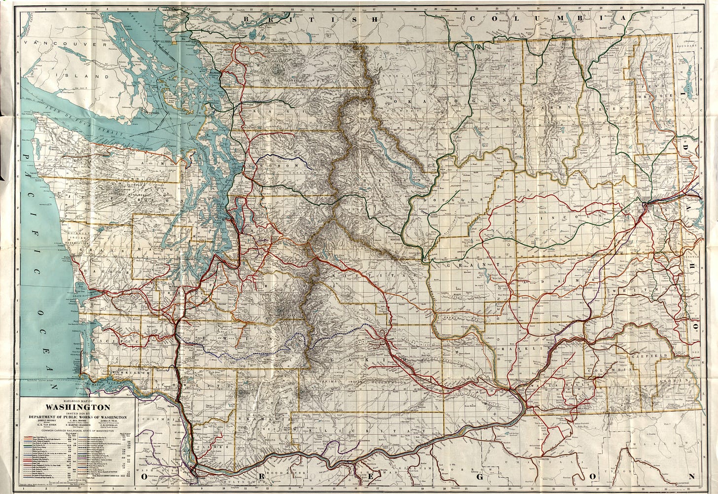
above is the map of washington rail services i used for the bulk of my research and “ensuring realism“. it was published in 1924 originally by the WA department of public works, and now is being used by a very physically sweaty child to make their dumb little crayons. how the turn tables
what i liked
connection icons
i spent an embarrassingly long time trying to make nice faux-Amtrak and faux-VIA logos in order to be able to depict the intercity rail transfers without violating copyright law. these were also present in the Boise crayon from earlier, just in an Amtrak-only space.
i’m not too happy with the Amtrak one, but it’s a nice-ish version of the pointless arrow! the annoying portion is the white in the middle, which contrasts Very poorly with the background, meaning I had to add a terrible, awful black outline to make it pop a bit without defaulting to yellow.
VIA’s fake logo is much closer to the real logo, which might present issues, but it looks less homebrew.
portland-originating lines
i very much enjoyed making the fun line colors for Seattle, Idaho, and Portland-originating lines. there isn’t much consistency to these, and i would definitely like to change that a bit.
challenges
mapping the lines to Lewiston, Pullman, and Moscow terminating in the Tri Cities
i had tacked these lines on later than i had expected originally, and geographically, i’d originally assumed the line into Walla Walla would simply continue onto Idaho. after a few looks on ORM, this line doesn’t quite exist. but no matter! service to Moscow and Lewiston were much better oriented to originate out of either Pasco or Kennewick instead.
after killing off the Walla Walla ideas, my second plan was a terminus in Pasco, which proved to be. tough to map while not creating extremely uncomfortable positioning for the Pasco label or potentially causing confusion as to whether the Idaho lines stop in Pasco or not.
adding the WES Commuter Rail line
the WES is the dinky to end all dinkies. presently, it’s a five-stop, 15 mile long rail line running from Beaverton to Wilsonville; extensions to Salem have been in talks since 2010. so i threw the extension on the map.
this line was a pain in the ass to add in. it’s the most interesting out of all of the services drawn, as it’s a line lacking any interlining with other parallel services, and only one interchange to another line in Tualatin. this was the last line i added to the map. i will address some minor points about the two Salem stations in the next main header.
what to change
okay!
first, i made a terrible decision accessibility-wise making all the lines so similar in color. in hindsight, it was not a good idea! i would probably change that. at least a bit.
my perpetual nemesis of ALIGNING STATION BLOBS WITH STATION LABELS strikes again too. gotta. figure out a pattern
local transit connections should be listed, but boy do i not want to make logos for each local agency.
i would also like to put on ferry routes as narrower, bluer water-based lines. but that’s for the future
oh and a dark mode map would probably look better but i fear that i am lazy af
from a route design perspective, eliminating one of the tiny local stops on the Tri-Cities<>Spokane route would make the map look nicer and less confusing and also probably speed up travel time in an area that would probably benefit from it.
more suburban rail in greater Portland would be nice, but i’m not 100% sure how to fit that in. would probably require immense reconfiguring of the WES lines.


oh my god we're so back
wow!! trains!!