

mapping AC Transit's owl services
ever want to see the hell that is my layer organizing system? no?

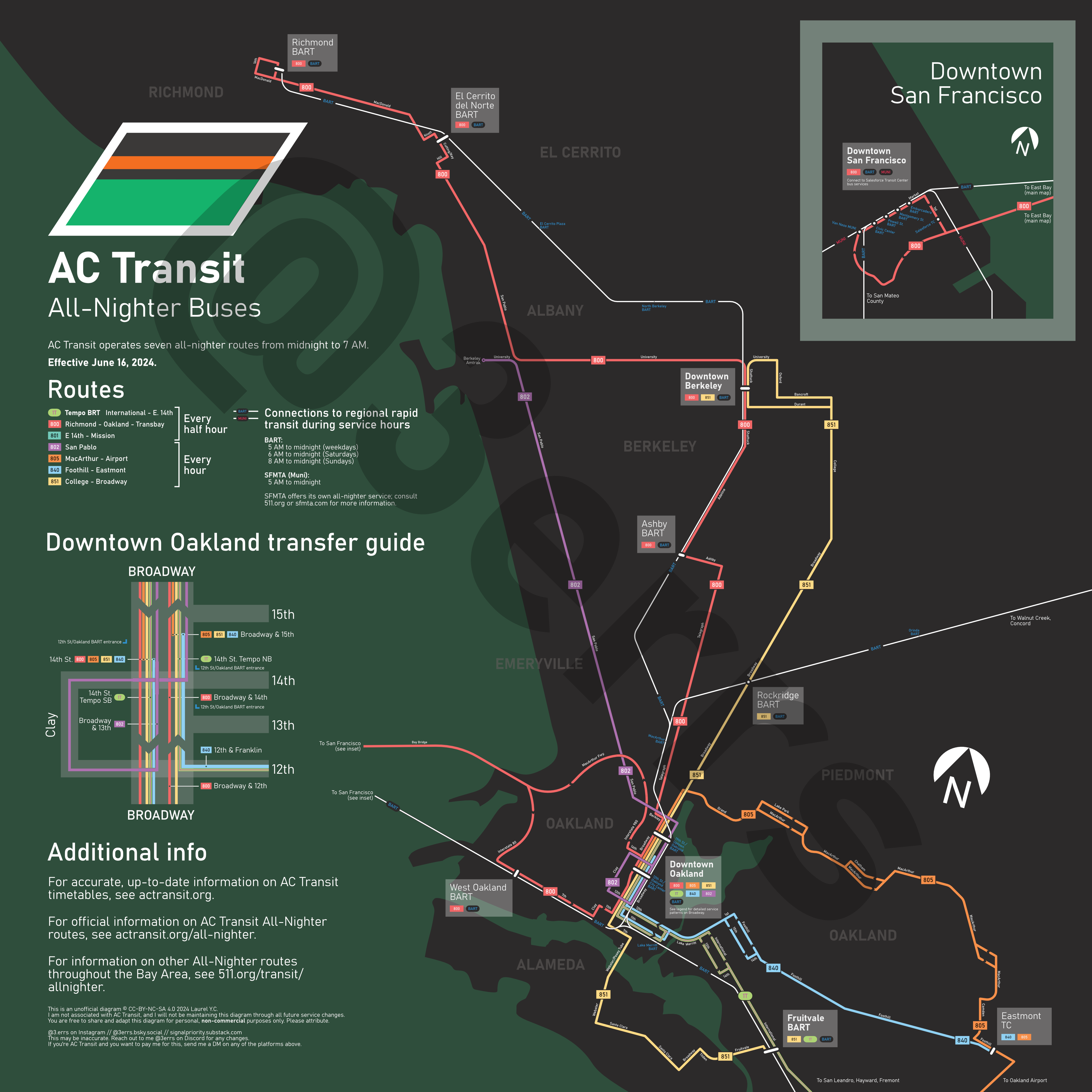
I’ve been posting these around slowly on my social media pages over the last month, but here it is: a full-fledged diagram of AC Transit’s all nighter services that I cooked up in about 15 hours of furious, neurodivergent working around New Years for competition submissions. This is the very first serious diagram I’ve done that 1. is not a crayon and 2. is not just screwing around with angles for 3 hours.
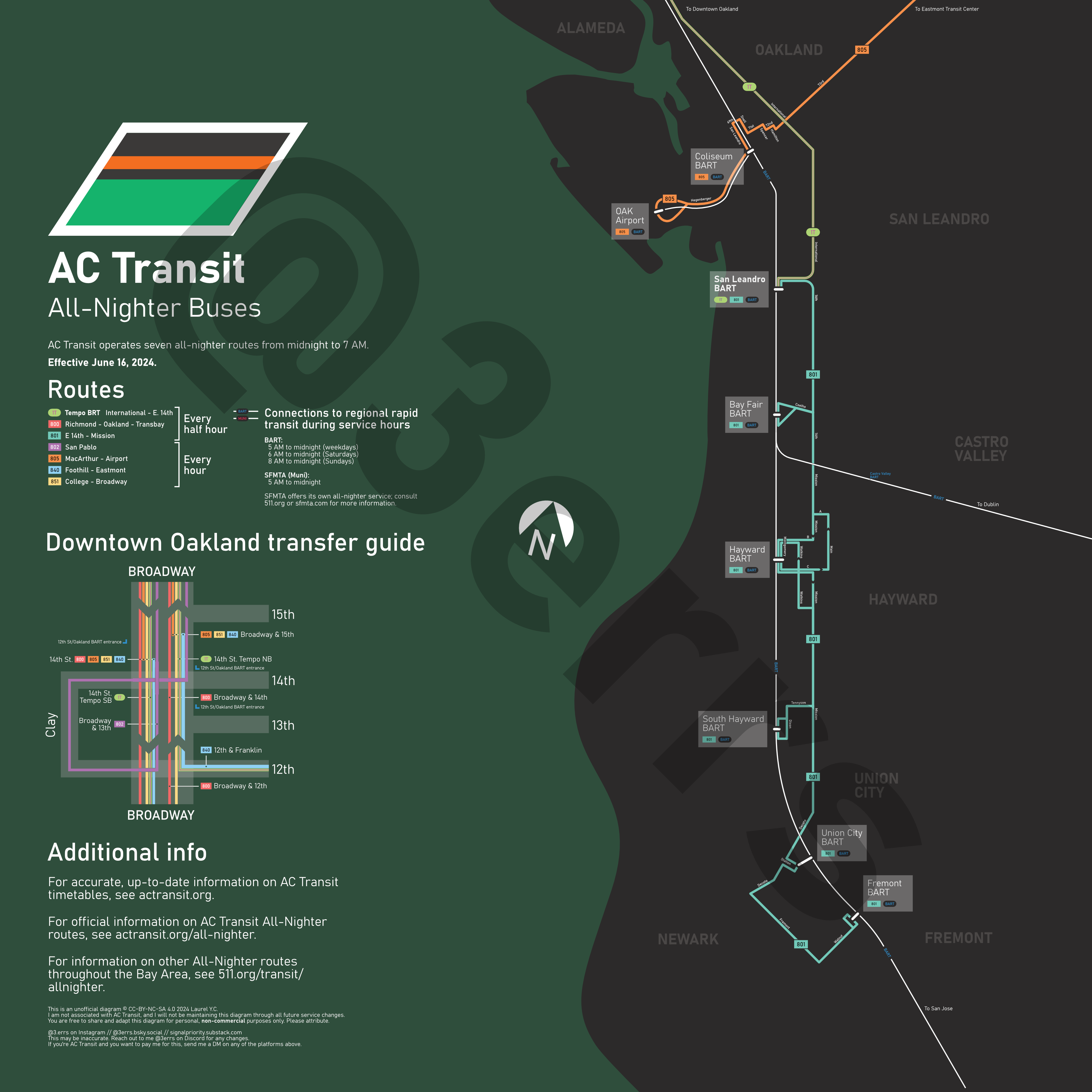
What you see above are AC Transit’s night bus routes north and south of Fruitvale. I figured this was a good place to cut the map, which was originally actually one poster, as it’s a relatively central station on the network. AC Transit operates seven overnight routes; you can find more information on that here, and more information on the rest of the Bay Area’s overnight transit network here.
the problem
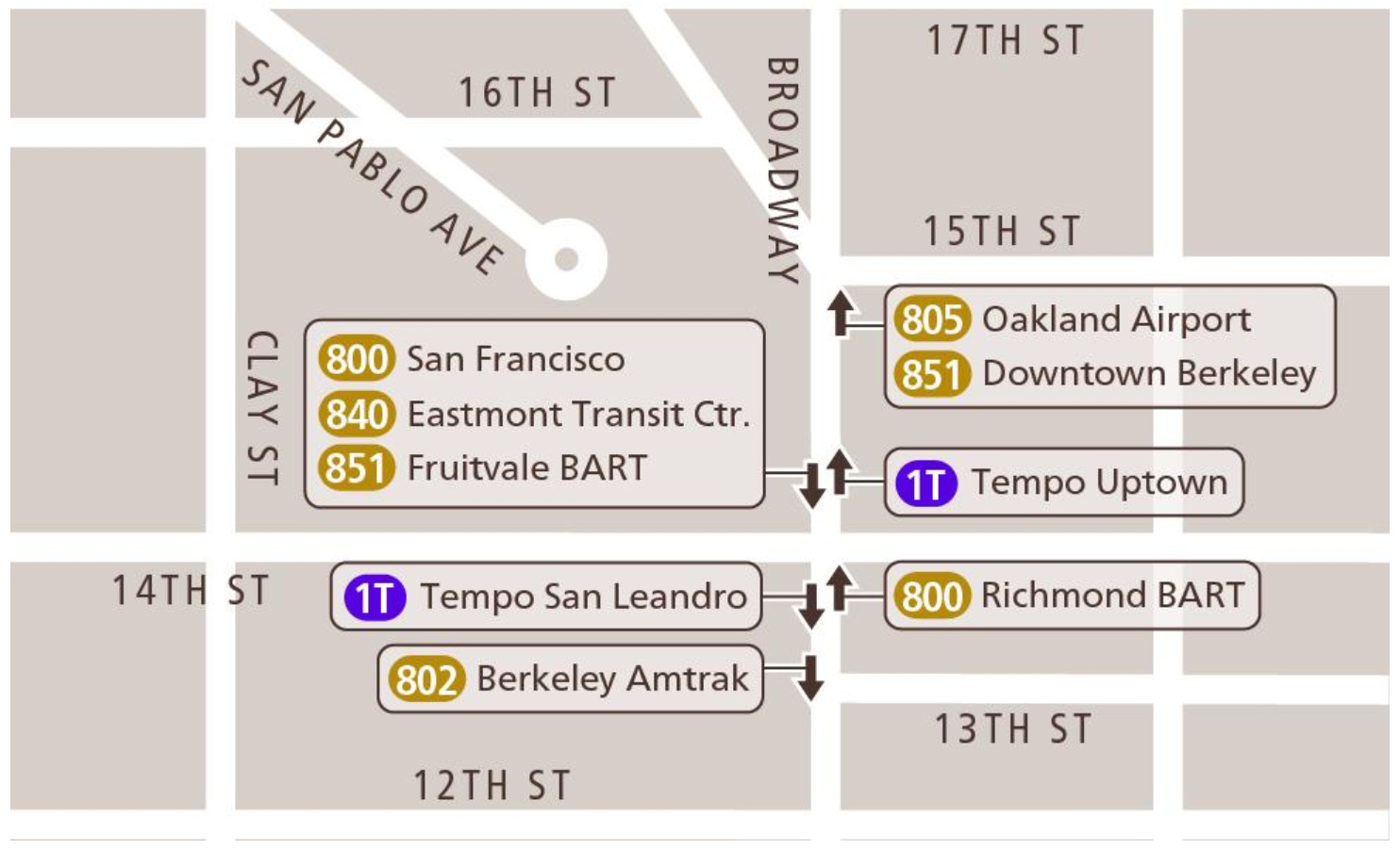
I came into this project with three main goals: first, to clearly differentiate between all seven lines on the network, two, to display the routing in downtown Oakland in a clear way, and three, to have a good, clear transfer diagram (the current one, from actransit.org, is shown below)
The current AC Transit system map, seen here, is remarkably awful at highlighting the existence of night buses. They are low-contrast compared to the tan background, and are treated just like any other normal route. When compared with SFMTA’s dedicated Owl service map, AC falls awfully short.
process gallery
Here are some screenshots from the process of making this, in roughly chronological order. I’ll analyze some specific choices and closeups after this.


things i like
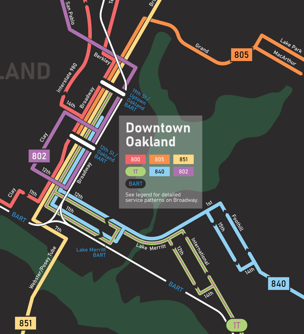
Downtown Oakland
This was a thoroughly enjoyable part of the map to diagram. Six parallel lines, a few masking lines, and a few one-way streets made this easier than I had originally anticipated, and since I started with this section first, the extremities of the map were pretty easy to complete. Nevertheless, I did keep finding mistakes and rough patches on this section.
I’m also generally surprised with how accurate the BART alignment ended up being. The Oakland Wye seems to be in the right spot geographically, and apart from 12th and 19th being a bit squished, everything else seems okay. Lake Merritt is made much larger than it actually is to compensate for this, though.
I also made the map a rainbow scheme based off of this. I thought it was fun. Readability and accessibility may be a bit difficult. Gotta make some compromises.
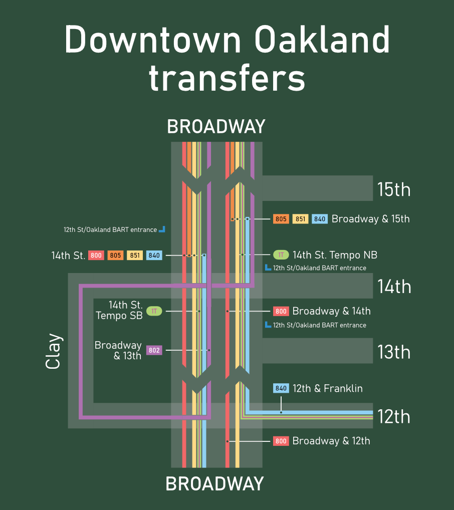
Broadway transfers
I’m conflicted on this. On one hand, I do believe this is a genuine improvement over the original. On the other hand, I’m not confident this could be interpreted very clearly with respect to the original map.
One improvement I think I’ve made is depicting where terminating buses drop passengers off, which the original schematic fails to do. The southbound terminating stop for 805 and the southbound equivalent for 840 are not shown in AC’s map. I think this is a case of “it doesn’t really matter because you know the bus will drop you off in that general area,“ but I think it provides some peace of mind.
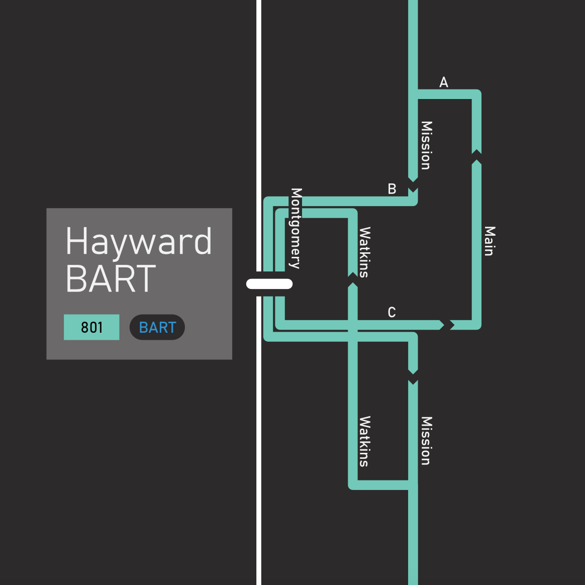
Hayward
Downtown Hayward is a mess of one way streets and bus service reflects that. AC Transit does an awful job at telling you which way the bus goes. Yes, its decipherable through looking on maps for a while, but god is that frustrating. I think I’ve made something pretty good to tell you where 801 goes in downtown Hayward.
what to change
mistakes
There are mistakes riddling this map. It’s extremely frustrating doing export after export and still seeing screwups here and there. Please tell me if you notice any. I won’t notice any.
freeways
I’d like to add freeways onto this map! Just probably as masking lines underneath the lines that run on freeways, but that would be a pretty nice addition. It would be a pain in the ass to map and might actually put the rest of the map to scale, unfortunately,
indicating frequency
I thought of this idea too far into the actual design process, but the half-hourly and hourly lines should have different visual appearances. A double cased line for hourly, a full line for half-hourly. This helps accessibility for vision-impaired folks, who I may have completely forgot to consider in the making of this.
accessibility
And more about accessibility! The colors chosen, although gay, are not particularly conducive to allowing access for colorblind and related folks.
my layer organization system
I have committed a cardinal sin. Because I made this in about ~16 hours over two days in an autistic rage of fury, I completely neglected to actually make layers to organize my individual assets. I am sorry. Each element on the map is completely arbitrarily assorted to just barely work and create whatever is going on there.
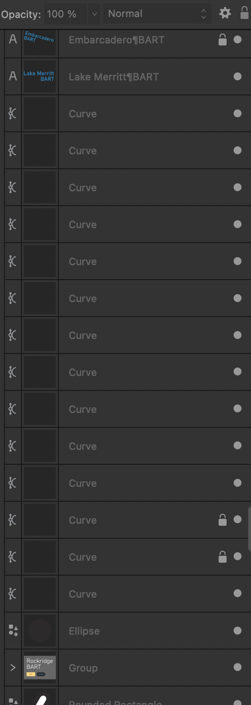
The raw file for this is disgusting and I never want to touch it again. A particularly funny sample is shown above. Whenever I got frustrated of moving something, I just locked it. I’m sorry. I promise to do better in the future.